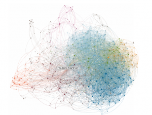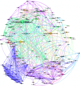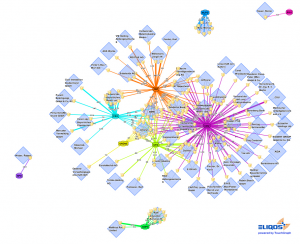
While we often talk of information glut and seek remedies to reduce or minimise this flow of information, mapping can be an initial feedback element.
Without getting to the crux of the problem – if there really is one – data mapping holds several aces in view of ever-increasing stockpiles and flows of information.
First of all, data mapping structures the information. Mapping can provide an initial level solution, whether this involves clustering the information to “discover” groups of documents, objects which have similarities or even to build up sometimes complex document trees on several levels and which are sometimes interlinked.
Nevertheless, it could be said in essence that these aces are more linked to statistical calculation (one of the examples is text mining to identify salient themes and terms that allow clusters to be built up) or to the use of the metadata of the items observed than to the mapping itself. This is true. A map is always based on data and the more reliable this data is, the more structured and qualified it is, the greater the possibilities offered by mapping this information will be.
However, mapping in itself incorporates various advantages that are linked to visual representation.
- The spatialisation of a world allows more interpretation aspects to be added and the position of each object in relation to others can be used to provide meaning. Some mapping solutions even go as far as to offer three-dimensional displays so as to enable the simultaneous display of a larger number of variables and the relationships they maintain.
-
The map display makes an impact. It’s obvious that the adage “a picture is worth a thousand words” also makes sense in a professional world. Ease of storage and communication are elements that can transform the data into information for those who receive it.
- The map can be interactive and provide a means of exploring the dynamic data, enabling time to be saved when reassessing sets of information from another point of view or at another level of depth.

Consequently, mapping is a real boon for those who may manipulate the data, the information. For processing it, for exploring it and for communicating it.
However, the advantages of mapping should not allow its pitfalls to be forgotten. Mapping is in the main only worthwhile for the information whose display it enables. Completely unstructured and incoherent information, a distorted mapping input collection process and meaningless spatialisation algorithms are likewise errors that can turn mapping into a counter-productive tool which could even go so far as to distort the information.
In order that data mapping is indeed a real business tool, it is vital that it is treated seriously and not as a mere visual gadget and that the information collected and the map views are processed and produced by people who understand the operations they’re carrying out and the choices they’re making at each stage and that they likewise understand the impact this will have on the maps that are produced.
At the end of this map building process , it will then be possible to read and analyse this mapping by incorporating the choices made during the creation process and being aware of the de facto limits of the mapping.
What are the main types of mapping you come across in business and what are the difficulties encountered in creating them?
For a start, I would make a distinction between mind mapping and data mapping.
- Mind mapping is a particularly effective work and display tool, but one that has different characteristics from a data mapping tool, which for me would be the following:
- Data mapping must be able to process and display large volumes of data.
- It must also be able to spatialise the data automatically according to this data or the variables of this data or variables resulting from the relationships between the objects.
- Finally, it must provide tools for graphic display and data differentiation (sizes, colours, spacing).
The maps that I come across most in business today are:

- Maps linked to the Web and enable working on website networks and facilitate the identification of the relationships between sites around a topic. These maps are particularly effective since they address two obvious problems of volumetric analysis (of sites and pages) and complexity of interactions. The main limits of this type of mapping are based on the upstream extraction of the relationships between sites.
- Human network maps which are based on data either collected and rated “by hand” or on data collected automatically and which provide a point of view of a network of people (e.g. map of emails exchanged or phone calls made, e.g. map of “public” or business social network address books, for example).
- The “market intelligence” maps which are used mainly in Competitive Intelligence or Business Intelligence Departments and enable the mapping of relationships between economic stakeholders, products and markets and the display of the respective sizes of these stakeholders on their markets. They are different from Web-oriented maps since they map a world whose objects are not uniform and can cope with different and more complex relationships than a mere sharing of links. (For example, company X has company Y as a subsidiary which produces the product range A1 and A2 with a volume of 10,000 in country 1 and 350,000 units in country 2 respectively.) They are also different due the complexity of the information to be displayed in one and the same space: people, companies, products, results, turnover figures, market shares, etc.
- Document maps that enable the display of and/or interaction with structured (with metadata and definite fields) or unstructured sets of documents. They can be used in bibliometrics for example, but also for scientific monitoring of sets of patents.
There is nevertheless an infinity of uses for mapping. There is no shortage of data today and it deserves to be processed by mapping.
Finally, here’s some sound reading matter and lines of inquiry on information mapping to finish with.
Softwares for mapping and dataviz :
- Pikko Software which enables the representation of complex bodies/relational data models, and does so in a fairly flexible way, with its Vision Link Desktop and Server tool.
- Touchgraph, more relevant for processing larger but less complex volumes of data. They became known for their Google results mapping (using the related command) and their Facebook address book mapping demonstrators.
- Analyst Notebook, highly prised by official inquiry and investigation organisations. Very powerful and its recent buyout by IBM should enable it to grow. Its only drawback: the complexity of getting used to it and incidentally its price.
- Just Map it!, mapping solution supplied by Social Computing, which has just launched a mapping solution enabling the mapping of RSS feeds and the posting relationships between them means of tags.
-
And finally, Gephi! THE open source mapping software. A rather active community is developing and sharing several plug-ins and a solution that is constantly being developed. Cannot be ignored, slightly clunky to get used to, free. One criticism which I want to make about it..: it’s not possible to make the links clickable.
I’ve probably forgotten some. This list is not meant to be exhaustive…#uselessclaims
In the must read group:
- Infosthetics. Absolutely outstanding. Source of inspiration and of thought. Trying to reconcile the pretty with the useful. At any rate Infosthetics gives us imagination and aestheticism. It is your job to see how to apply all these pretty pictures to your business.
- Likewise very good, Visual complexity which makes an inventory of various mapping projects.
The French blog on this topic: Serial Mapper, run by Claude Aschenbrenner. Cannot be ignored.
The book :
Just must be read. And looked at. Data Flow 2 (and Volume 1 too).
The final word: to tell you that mapping tools and algorithms are not an end in themselves. It is your job to you to know what you want to map, to make assumptions, to get usful data for yourself and then to subject it to the scope of your expertise when reading and analysing the data.
And incidentally, if you need a helping hand, this forms part of the sets of projects that Actulligence Consulting has been lucky to be working on for several months now (<= advertising inside. The blogger but above all the businessman in me requires it.)


